more feedback needed

UPDATE: On the home stretch.^

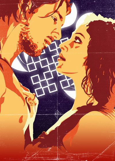
YET ANOTHER UPDATE: This is how it's progressing along. Before you can say "it's over-rendered", I know. But it's meant to be. I wonder if those creases and the distress are a bit redundant now?

 UPDATE: Above is the poster, still in progress (particularly the type.) To the left is the design for the banner (again in progress. Damn, can't seem to get the type right.)
My teacher suggested going much more outlandish/dynamic with the type, so I whipped this up (below). What do you think? Should I start the type all over again?

I think the cropping might also be more of a distraction on the poster. Maybe if I pull out a bit, there'll be more room alotted for the type and sponsor logos. There's the whole illustration to give you an idea.

=================================================================

After a really busy week and a harsh cold, I'm finally getting into my homework. As usual, I'm really behind. I'm designing a Bollywood Film Festival poster (as well as other ads for it) for a school assignment. This is what I've come up with so far. Gotta put in the logo and other details yet. It's funny, looking at it outside of photoshop and illustrator I can already see things I need to fix, particularly
the dude's chest. That's totally out of whack.
I'd be interested to hear what you think about the colours etc. Should the composition be tighter? A bit more intense maybe?
The image is taken from a the film, Madhoshi.
Oh, and I'm using CS3. It's seem pretty good so far; no new learning curve at least. The only nifty new function I've found so far is the eraser in Illustrator. As Pootie would say, "Sa da tay, my tipi tais. Sa day tay."


2 Comments:
Love the posterisation effect and the composition, but the blue-white square things in the background are distracting me. When I first glanced at the poster I thought they were swastikas. (The bright Klieg lights are good, though -- very "movie set".) Maybe a more nebulous background in between them, or some kind of other shape from a film set?
I really like the flyer.
The way the text looks like it's flying out at the reader and that it stretches from a long distance away.
Post a Comment
<< Home