more posterism
 [Update: The final^]
Here's another poster heading toward a final draft. I appreciated the feedback from the last one. The client was pleased, but I wish I had known the final size was A3 and not A2 as I was told. Would've used a different line thickness in the illustration and changed the fonts and enlarged the Ding Dong logo.
This one needs more text running down the side – it will be changed from month to month. Was thinking of putting a blank scroll, but was leaning toward just running text over the top (on the right hand side).
Not sure about the typefaces on this new one either. Down the bottom it's House Industries' Neutraface [Titling].
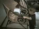
The brief is a "circus" feel.
Below is another draft that I thought I'd share. I like it, but it doesn't really scream "big top shenanigans and needlessly happy clowns".
Feedback: You know you want to give it.

posted by Lumpen at 3/03/2007 08:32:00 pm
![]()
![]()


3 Comments:
Definitely go with the first one -- the shopping cart one doesn't work for me at all. (Even though I realise you probably can't buy a tiger at the Market Day.)
Love the washed-out-ness -- really says 19th c. circus to me. I think the "Food" and "Stalls" are getting lost, though, since they're not tied in to the same graphic element as "Info" and "Entertainment". How about putting a starburst beneath them all (bring it forward of the bottom of the ball and let it get cut off by the border) -- then they're all together and they'll also stand out more. They should be more important than "RMIT Student Union" anyway, I think.
gee, i really like the shopping cart poster - i like the concept behind it as well as the artwork itself. i like the tiger version, but not as much.
can't say as I'm laughing too much at the bear mauling...
Post a Comment
<< Home